Create Your First Project
Start adding your projects to your portfolio. Click on "Manage Projects" to get started


Soul Foods
A hypothetical mobile solution designed for the local grocer "Soul Foods" a neighborhood store aiming to help busy customers bypass the frustration of crowded aisles and hide-and-seek shopping.
Prompt
A grocery shopping app for local grocery stores that helps customers shop faster, find items easily, and reduce time spent wandering the store and clear navigation, especially for busy shoppers.
The Challenge
Shopping at local grocery stores often involves a trade-off: you get community charm and specialized goods, but you lose the organized efficiency of giant chains. Busy shoppers frequently experience:
-
Wasted Time: Wandering aisles looking for niche items (e.g., "Where is the tahini?").
-
Backtracking: Realizing they missed an item in Aisle 1 while standing in Aisle 10.
-
Decision Fatigue: Navigating crowded spaces while trying to stick to a budget or list.
-
Language Barrier: Not able to communicate with the sales associate at the store.
Let's talk to people & learn their pain points
I conducted interviews by sharing questionnaire on my local grocery store's WhatsApp group. Insights gathered from user interviews revealed recurring needs, frustrations, and goals. These findings helped shape the persona that represent our key user groups.

Tanu Biswas
"I need grocery shopping to be fast & simple."
"Sometimes I remember what I need at 2 a.m. while feeding the baby."
Tanu recently became a mother and is adjusting to a new rhythm with very little sleep. Leaving home with baby feels like planning a mini expedition. She relies heavily on her phone for quick solutions, finding deals and saving time wherever possible.
Goals
-
Quickly buy groceries without roaming aisle to aisle in grocery store..
-
Easily find healthy options.
-
Stay within family budget.
Frustrations
-
Forgetting items when making list.
-
Long checkout lines takes too long.

Joseph
"Sometimes I encounter difficulty when sales associate speak very quickly and I am not able to follow the direction."
Joseph recently moved to united states with his family from Nairobi, Kenya. He is enrolled in online college classes and is also taking classes at night school for learning English. He is Juggling with his current situation and hardly find any time to focus on his passion.
Goals
-
Would like to shop in grocery store without encountering difficulties due to language barrier.
-
Find ingredients which are essential to his food from home.
-
Save money through deals and coupons.
Frustrations
-
Large store layouts feels confusing and unfamiliar.
-
Not able to understand prices, labels, and promotions clearly.
Problem Statement
Busy professionals and primary household shoppers need a way to streamline the grocery process—from list-making to checkout— because current shopping experiences are fragmented, leading to wasted time in aisles, mental fatigue from decision-making, and frustration with unpredictable delays.
Goal Statement
Our Soul Food app will allow busy shoppers to locate items instantly within the grocery store, which will positively affect users with limited time by streamlining their navigation and reducing total shopping duration. We will measure effectiveness through in-app feedback surveys and task-completion speed.
Journey mapping of the customer
This journey map explores the customer's path through the grocery shopping process, uncovering pain points and opportunities to create more seamless experience.

The Design Process
Framing the design problem
To move from a broad idea to a focused solution, I framed the design problem for the Soul Food app by analyzing the following key pillars.
The problem I am trying to solve
-
Help the local grocery store to improve service for their customer.
-
Make the process fast and efficient.
Impact I am striving for
-
Help customers find everything they needing store without any difficulties and eliminate search and wander phase.
-
Help them shop faster and in more efficient way.
-
Make the process user centered and user reliant.
Users Involved
-
Customers: These are the people whose pain points are solved directly.
-
Stakeholders: They benefit from reduced floor congestion and higher customer satisfaction.
Let's take a look at the site map
Before moving into wireframes, I mapped out the app’s structure to reflect the mental model of a busy shopper. By organizing features into a logical hierarchy, I ensured that high-priority tasks—like accessing a shopping list or viewing a real-time store map—are always just one click away.

Main activity

Other
Big Picture Story Board
After mapping the structure of the site, the next step is to zoom out and see the experience as a living story board. To visualize the value our app brings to the physical shopping experience, I’ve mapped out a full user narrative. This storyboard tracks the transition from a customer’s 'pain point' -the inability to find an item to the 'aha moment' when our app simplifies their journey and leads them through a frictionless checkout.

Low Fidelity Sketches
With the user's journey visualized, I’ve moved into low-fidelity paper wireframing to define the core layout and information hierarchy. This stage allows for rapid iteration on the app's structure.


Low fidelity Digital Wireframes
Building on my initial sketches, I’ve translated the concept into these low-fidelity digital wireframes in Figma. These lo-fi digital wireframes serve as the structural blueprint for the app. This stage allows us to define the spatial relationship between elements and refine the navigation hierarchy before moving into high-fidelity design.


.png)
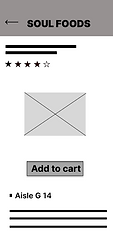
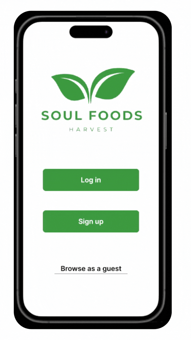
Hi - Fidelity Mock ups
Bringing the vision to life: these high-fidelity mockups integrate our final brand identity, color palette, and interactive elements. By moving into high-def, we can now see exactly how the visual hierarchy and aesthetic choices enhance the user journey from confusion to checkout.


Let's check out the high fidelity prototype
With the visual design finalized, this high-fidelity prototype simulate the end-to-end user experience. This interactive model allows us to test the navigation logic and tactile feedback, ensuring every tap and swipe feels intuitive and purposeful.

That's a wrap !
It’s been incredibly rewarding to watch this app evolve from rough paper sketches into a polished, high-fidelity experience. I’m proud of how the final design solves the core user pain points we identified. Thank you for your time ! Hope you enjoyed it as much as I did.